Our reviewers evaluate career opinion pieces independently. Learn how we stay transparent, our methodology, and tell us about anything we missed.
Our reviewers evaluate career opinion pieces independently. Learn how we stay transparent, our methodology, and tell us about anything we missed.
Metrics are that sturdier thing, as long as you pick the right ones. Pick the wrong ones, and you’ll spend months optimizing for numbers that do not map to real user success, which is a special kind of pain.
What you track is what you focus on, so I treat metrics like a menu, not a mandatory buffet. I keep a small set of quantitative metrics for throughput and performance, and I pair them with qualitative signals so I don’t misread the numbers.
If you want the “what does good look like” baseline first, check how to test documentation usability.
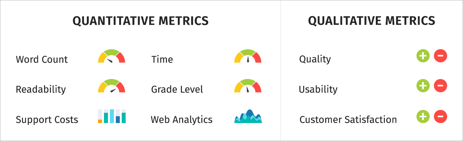
Quantitative metrics are measurable and trend well over time. The big usability question is whether the metric helps you make a better decision, not whether it is easy to collect.
These tell you how much you shipped and how fast you shipped it, which helps you plan and set expectations when you have a backlog.
This is the count of docs you publish, split by doc type (tutorials, how-to, reference, troubleshooting). It helps you answer “are we shipping,” but it does not answer “are we helping.”
The best way to use it is for capacity planning. If you shipped 12 topics last month and only 2 were troubleshooting, you now have a signal about where your effort went and what might be missing.
Cycle time measures how long it takes to get a page from “work started” to “live.” It’s one of my favorite workflow metrics because it identifies bottlenecks without turning writers into productivity robots.
The usability win is predictability. If cycle time spikes, it means reviews are slow, the scope is unclear, or tooling is fighting you.
This measures the lag between “review requested” and “review returned.” It’s a proxy for collaboration health, and it helps you explain delays in a way stakeholders understand.
If review time is long, you can fix it with better review checklists, smaller review batches, or earlier SME alignment. This pairs well with how to work with SMEs because it’s a process issue, not a people issue.
This tracks how key pages get refreshed. It matters because high-traffic pages tend to be costly when they go stale.
A page can be popular and wrong at the same time, and that’s the worst combination. Update frequency helps you treat docs as a living system rather than a one-time deliverable.
Time tracking sounds scary until you do it in a lightweight way. I track time in buckets because the metrics are for planning, not surveillance.
This shows where your effort goes. Many docs teams discover that “writing” is a small slice and “unblocking” is the real job.
When you can say “we spend 35% of doc time waiting on review,” you get permission to fix the process. Without it, everyone assumes the writer is slow.
A 300-word release note and a 3,000-word onboarding tutorial are not comparable, even if both are “one doc.” I like to tag deliverables as small, medium, and large, then track effort within those bands.
The usability here is forecasting. You stop promising three “docs” in a sprint when one of them is a mini book.
Readability metrics are not the truth, but they are a useful alarm bell. I use them to catch “this paragraph got weird,” not to chase a perfect score.
Flesch Reading Ease estimates how easy text is to read using sentence length and syllables per word. The formula is a standard one: 206.835 minus 1.015 times average sentence length minus 84.6 times average syllables per word.
Usability-wise, it’s best for consistency. If your doc set scores around a certain range and a new page is harder, that page needs simplification or better structure.
Flesch–Kincaid Grade Level
This expresses readability as an approximate US grade level and uses a formula based on words per sentence and syllables per word.
The usability is audience fit. If you’re writing end-user docs and your grade level creeps into “college dense,” it’s a signal to tighten sentences, define terms earlier, and remove clutter.
If you want these scores to matter in real workflows, this is where a team-wide standard helps, and a technical writer style guide makes readability improvements stick.
Qualitative metrics tell you whether documentation is working for humans. I treat these as the “why” behind the numbers.
A simple “Was this helpful?” widget gives you two useful things: a trend line and a comment stream. The rating trend shows direction, and the comments tell you what to fix.
The usability of this metric is triage. If people keep saying “missing prerequisite,” that’s not a writing style issue, that’s a structure issue.
Usability testing is where you stop guessing. A simple test can measure task success rate, time-on-task, and where users get stuck.
The usability value lies in its ability to produce actionable fixes. When three users fail the same step, you have a clear rewrite target and a clear way to validate the improvement.
If you want a practical starting kit, use documentation usability testing, and keep your tasks realistic.
Internal feedback matters most for accuracy and completeness. It matters less when it becomes opinion ping-pong about phrasing.
The usability move is adding structure. A review checklist that asks “is anything wrong or missing” produces better feedback than “any thoughts?”
“Quality” is too vague to measure. I break quality into attributes and measure them through sampling and defect tracking.
Accuracy is hard to measure, so I use proxies that correlate with “this doc causes problems.” I look for signals such as recurring support tickets for the same page, engineers correcting instructions in Slack, or users skipping documented steps.
If a document repeatedly generates confusion, misconfiguration, or rework, that’s a sign that something in the explanation, structure, or assumptions is off.
This is the number of confirmed issues, such as wrong steps, outdated screenshots, incorrect parameters, or broken workflows. It’s honest and useful.
The usability is prioritized. If one guide produces five defects a month, it deserves attention more than a low-traffic page nobody reads.
These are defects found through support tickets, engineering reports, or user complaints after a doc goes live. This metric is painful, but it is one of the strongest signals of doc risk.
Usability is a process improvement. Escaped defects point to weak review coverage, missing test steps, or a mismatch between what shipped and what was documented.
This is the percentage of pages approved with minimal changes on the first SME review. A high rate means you are gathering requirements well and writing accurately.
A low rate means you need better intake, stronger examples, or earlier alignment. For developer docs, how-to guides on writing API documentation help, because most errors stem from unclear auth, missing edge cases, or misleading examples.
Completeness is “did we answer what the reader came here for.” I like measuring it with a coverage map tied to user journeys.
Instead of thinking about documentation as isolated pages, I map the key tasks a user is trying to complete and check whether each step in that journey has clear guidance.
Create a list of key tasks and concepts, then mark which have docs. The metric is the percentage of coverage for critical flows.
The usability is gap-finding. It’s easier to defend work when you can say, “we cover 70% of top onboarding tasks, and the missing 30% correlates with support volume.”
If your internal search shows “no results” for common queries, that’s a completeness signal. This is one of the best low-effort ways to discover missing docs.
The usability is high because it tells you, in your own words, what users are trying to do.
This is where your editorial system earns its keep. I measure it with periodic sampling, not by policing every sentence.
Every so often, I review a handful of pages from different parts of the documentation to see whether the voice, structure, and terminology feel consistent.
Pick a small sample each month and score pages for clarity, conciseness, and consistency. You’re looking for trend improvements, not perfect numbers.
The usability is coaching and standardization. You can identify patterns like “missing prerequisites” or “unclear headings” and fix them across the doc set.
If your docs touch regulated content, compliance metrics are not optional. They protect users and the company.
Compliance is easiest to measure in terms of presence and traceability. I track whether the required elements exist and whether they have been reviewed.
Required notices and disclaimers present
This checks whether regulated pages include mandated notices, disclaimers, warnings, or safety statements. The metric is pass/fail and sampled across critical pages.
The usability is risk reduction. Missing a required notice is a legal and operational problem, not an editorial preference.
Some environments require citations or evidence for claims. Track whether citations exist and whether they are current. The usability is audit readiness. You do not want to chase citations during an audit.
This tracks whether regulated docs have been approved by the appropriate reviewers. It can be as simple as “approved in ticket X” or “signed off in system Y.”
The usability is defensibility. When someone asks who approved a claim, you have an answer.
Privacy and security regulations require specific wording or explanations around data handling. The metric here is whether required statements exist, match product behavior, and are updated when product behavior changes.
Usability prevents “outdated security guidance,” which is one of the most expensive kinds of doc debt.
My favorite compliance metric is boring and effective: checklist adherence rate. Sample pages and score whether they meet checklist items like terminology, required sections, warnings, and review evidence.
The usability is that it turns compliance into a routine habit. Audits go better when your own process is already strict.
Performance metrics help you understand how documentation behaves in the wild. The usability trick is interpreting them correctly, because engagement is not always success.
Traffic volume tells you demand, not quality. I use it to decide what to prioritize for maintenance. Search queries tell you intent. If people search “reset password” 10,000 times, that page should be perfect.
If your docs live on the web, Google Analytics and Google Search Console are the starting point.
In Google Analytics 4, bounce rate is defined in terms of engaged sessions. It represents the percentage of sessions that were not engaged, and engagement is defined by criteria such as time on page, conversions, or multiple page views.
The usability is diagnostic, not judgment. High bounce can mean “wrong page,” but it can also mean “got the answer quickly,” so I always pair it with search intent and feedback comments.
Slow docs create fake content problems. If the page loads slowly, users leave before your words even get a chance.
For web docs, I track Core Web Vitals because they measure real user experience signals like loading, responsiveness, and visual stability. Google’s Core Web Vitals reporting focuses on LCP, INP, and CLS.
For quick checks, Google PageSpeed Insights is a handy tool, and for deeper testing, I use Lighthouse.
Different stakeholders need different metrics. If you report the same numbers to writers, managers, support, and legal, you’ll confuse everyone.
Writers need metrics that help them improve the craft and workflow. I keep it focused.
If you’re building benchmarks as an individual contributor, technical writing skills help you map what to improve next.
Managers need metrics that show program health, risk, and outcomes.
If your documentation program is scaling, thinking in terms of systems helps, and single-source authoring is a good mindset even if you never implement it.
Support cares about faster resolution and fewer tickets. Product cares about onboarding success and activation. Engineering cares about accuracy and fewer escalations that start with “the docs are wrong.”
The usability move is to align metrics with pain. One strong metric per group, plus a short story and an example, beats a dashboard nobody reads.
Usability and accessibility metrics protect real users and reduce invisible friction. They also tend to be neglected until someone complains loudly.
If users cannot find content, the content does not exist. I track internal search success, search refinements, and navigation paths for key pages.
This is where structure matters a lot, and how to write software documentation gives you a workflow for building findable doc sets.
I measure scannability through periodic sampling: heading clarity, paragraph length, prerequisite visibility, and ease of spotting key steps.
If you want a library of formats to compare against, browse technical writing examples.
Accessibility is part of quality. At a minimum, images need appropriate text alternatives, which is a core concept in WCAG guidance for non-text content.
I track basics like alt text coverage, heading hierarchy correctness, and keyboard accessibility of interactive elements. The usability impact is real because inaccessible docs block real users from completing tasks.
Metrics matter only if they lead to improvements. If you measure everything but fix nothing, you’re just collecting trivia.
I tag feedback into categories like “missing step,” “unclear terminology,” “outdated,” and “can’t find info,” then trend those tags monthly.
Themes tell you what to fix across the system, rather than playing whack-a-mole with one comment at a time.
Docs decay because products change. I track time since the last update on top pages and on compliance-sensitive pages.
The usability is trust. Fresh docs get used, stale docs get ignored, and the user’s mental model becomes “docs are unreliable.”
This is my favorite “alive program” metric. It measures how long it takes to ship a fix after a doc issue is reported.
The usability is credibility. If you fix things quickly, users keep giving feedback, and your docs improve faster.
Technical writing metrics are about proving that your documentation helps users succeed, reduces risk, and supports the business.
If you want a simple starting point, pick three metrics: one quality metric (defects or rubric score), one usability metric (task success or helpfulness themes), and one performance metric (search gaps or Core Web Vitals). Track them for a month, learn what they mean in your environment, then expand slowly.
Here are the most common questions I get about technical writing metrics.
The most important metrics are the ones that map to user success and business risk. I start with a quality signal (defects), a usability signal (task success or feedback themes), and a demand signal (search queries or top pages).
They’re valuable for different reasons. Quantitative metrics show trends and throughput, while qualitative metrics explain why users struggle or succeed.
Executives care about outcomes, cost, and risk. Tie metrics to support volume, compliance readiness, onboarding success, and reduced time-to-resolution, and keep the story simple.
You can’t make quality perfectly objective, but you can make it consistent. Use a rubric and checklist to sample pages for accuracy, completeness, clarity, conciseness, and consistency, then trend those scores over time.
Track basics like alt text coverage, heading structure correctness, and automated accessibility check results, then pair that with manual spot checks for real usability issues. WCAG-based guidance on text alternatives is a strong baseline for what to check.
How often should I review and update technical writing metrics?
Review metrics monthly and update them when priorities change. If a new compliance requirement arises or the product shifts direction, your metrics should shift too; otherwise, you’ll optimize the wrong thing.
Get the weekly newsletter keeping 23,000+ technical writers in the loop.
Learn technical writing and advance your career.
Please check your email for a confirmation message shortly.


Get our #1 industry rated weekly technical writing reads newsletter.
Your syllabus has been sent to your email