
Our reviewers evaluate career opinion pieces independently. Learn how we stay transparent, our methodology, and tell us about anything we missed.
Our reviewers evaluate career opinion pieces independently. Learn how we stay transparent, our methodology, and tell us about anything we missed.
I learned UX writing the fastest way possible: shipping “tiny” copy changes that accidentally changed user behavior. The first time I saw a support spike tied to one button label, I stopped thinking of microcopy as decoration.
If you want the bigger foundation first, read my full guide on what UX writing is, and then come back here. This page is the practical “show me examples” companion.
When people ask for UX writing examples, they usually want one of two things: inspiration they can copy, or proof that words actually change outcomes. You’ll get both here, plus a few “please don’t do this” examples that are just as educational.
UX writing is the copy inside digital products that helps users complete tasks, make decisions, and recover from errors. It includes labels, instructions, onboarding guidance, error messages, confirmations, and those little moments you only notice when they go wrong.
If you’ve ever rewritten a single sentence and suddenly the flow “felt” smoother, that’s UX writing doing its job.
Good UX writing is usually clear, short, user-centered, and consistent. Great UX writing also respects emotion, timing, and context, which is where brand personality and empathy show up without turning the interface into stand-up comedy.
If you’re building consistency across a product, a content system matters too. The mindset overlaps a lot with building a technical writer’s style guide, even though the writing surfaces are different.
There is a mindset that every UX designer and good UX writer should follow. Here are several UX writings examples that showcase how they remain successful or unsuccessful in nailing it.
I grouped these by scenario so you can find what you need fast. If you’re building a portfolio, this structure also makes it easy to pick a scenario and create a before-and-after case study. For that, I’d keep UX writer portfolio examples open in another tab.
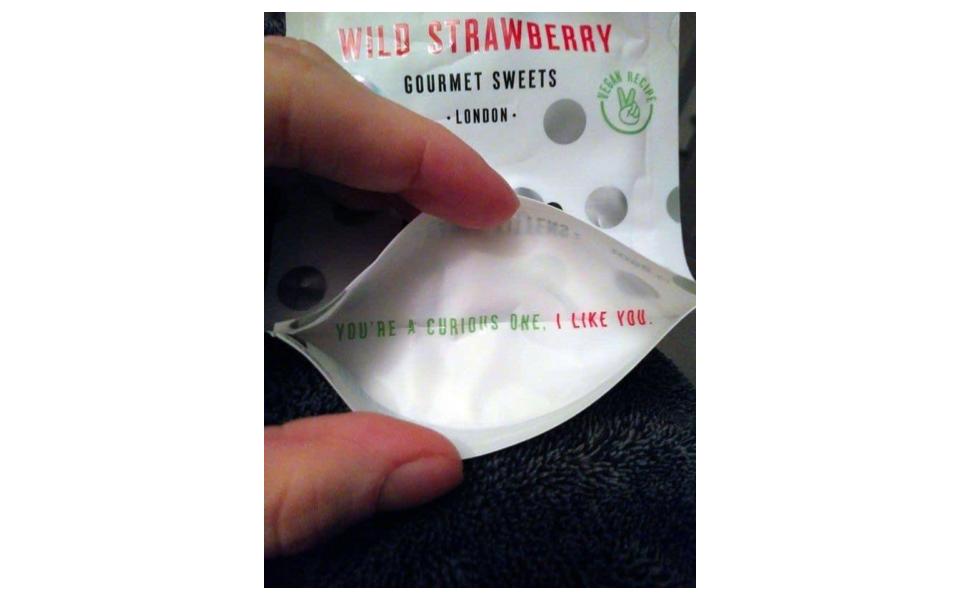
This is an ideal example for all those who think UX microcopy is limited to just digital products. Candy Kittens – a British gourmet company – puts a winning microcopy on the bottom of its physical products for its curious customers. It is one such copy that makes you smile for sure. The key takeaway is that a UX writer, or a content strategist, can make any product (physical or digital) exciting by using the right words at the right time.
UX writers create microcopy to guide and teach users how to use a product. User manuals should have simple and clear instructions written in a conversational tone. But, in the following example, the product assembly instructions are difficult to understand.
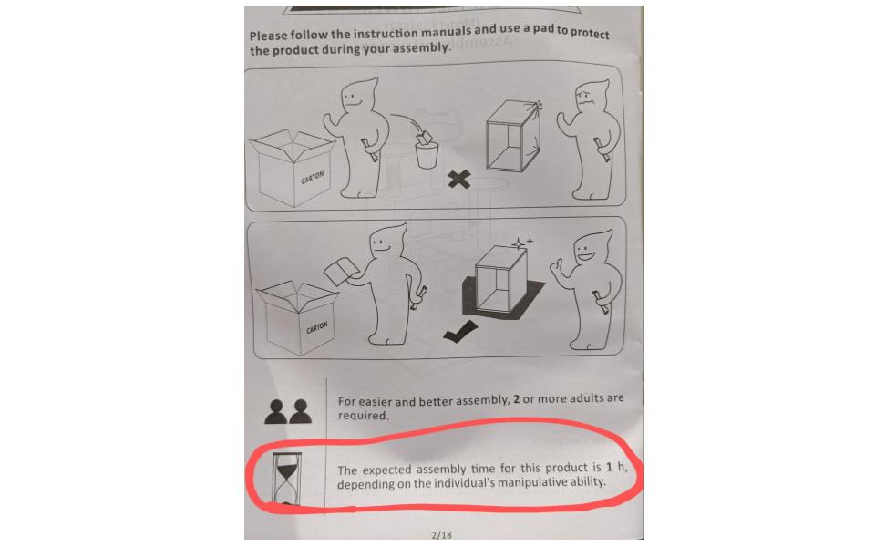
Here, the copy says The expected assembly time for this product is 1 h, depending on the individual’s manipulative ability. Besides sounding quite robotic, this copy also tends to offend those who take over an hour to assemble. The UX writer can make this copy nice and better by writing Under normal conditions, it takes 1 hour to assemble this product. This copy ticks all the boxes: simple, brief, and useful.
Products use dark patterns to create a deceptive UX design for nudging users to make decisions or take actions that benefit the business owner instead of the users. It is something quite the opposite of what user experience writers should do, such as creating transparent, user-focused designs.
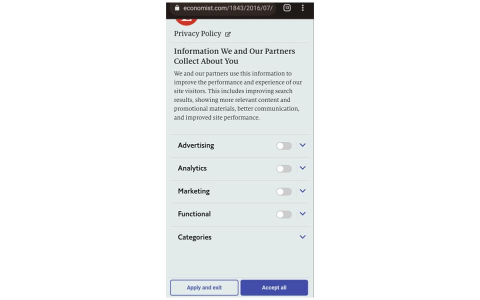
This is an example of poor UX writing, which uses dark-patterned CTAs to deceive users. The Economist – a popular news website – uses the same trick to get permission for cookies from users by making the Accept All CTA extra prominent than its counterpart. Though these tactics may prove effective in A/B Testing, they are poor examples of UX writing, and the UX writer should refrain from following these at all. Effective UX writing and UX/UI design are all about giving full control to users.
This is a wonderful subscription modal microcopy by Microsoft. The main heading is fitting and concise, while the subheadings address the user’s concerns using the optimal approach. Oftentimes, users have concerns regarding subscription charges and what will happen on its cancellation. UX writers and UX researchers at Microsoft have done commendable user research since this copy relieves the users of all those concerns in a great way.
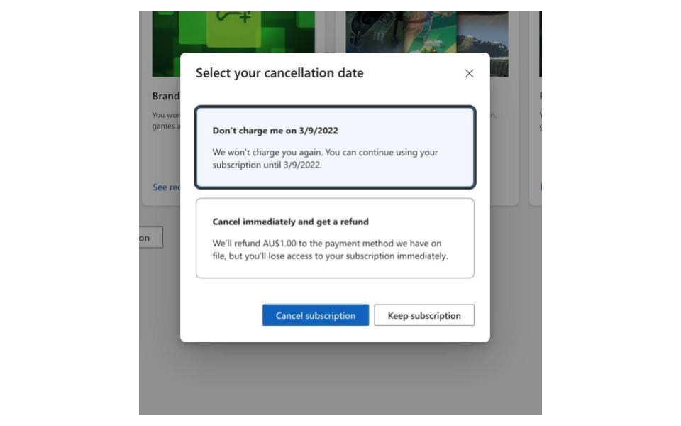
Now, unlike the previous example, the CTA here of Cancel subscription has a dark pattern, which helps the users achieve their goal instead of deceiving them. All in all, it is a great example of simple, useful, and succinct writing.
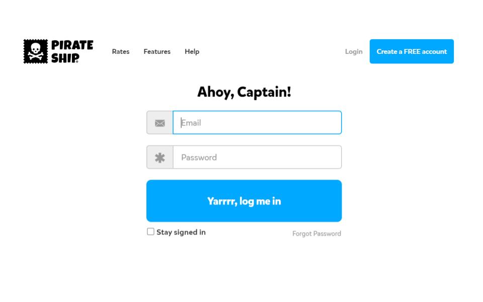
Now, this is an example of great on-brand UX writing, or UI text, from a shipping company named Pirate Ship. Here, they combine their clever greeting with an agreeable CTA, which works great for cheering someone up. The humorous touch by Pirate Ship makes this a delightful login copy.
In addition to unwanted notifications, there are some notifications that annoy and make the receivers feel bad at the same time. MyFitnessPal attempts to nudge its users to use their application yet they find no need to and ends up causing them distress. First of all, the user should have the control to manage their notifications instead of the app itself.
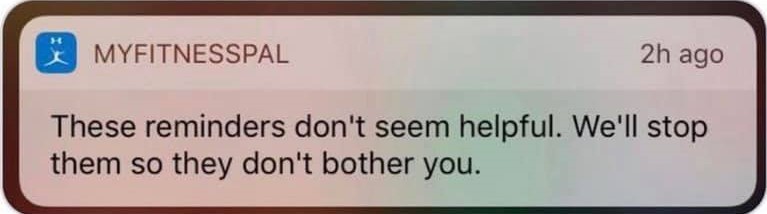
In the second place, their UX writers can improve the copy by writing Would you like to stop receiving reminders? This copy works better than the current one due to its conciseness and agreeable tone.
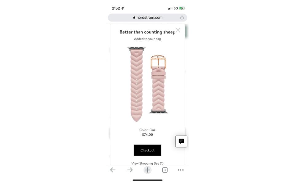
Here is one typical example of how to make a microcopy humorous. Nordstrom – an American luxury department store chain – uses a different copy at different times of the day. During the night, the potential buyers see a Better than counting sheep copy on the Checkout page as the company realizes that most of its customers do shopping at night. So, their UX writers took the time to make the checkout process delightful for their users.
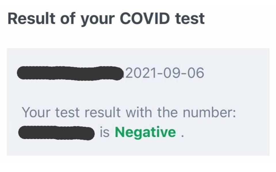
This example is about a mistake made by design teams rather than the UX copy. The result of the COVID-19 test of a person came negative. However, the copy indicates Negative using green color, which may mislead the person. The UX writer should understand that the UX design and copy should complement each other. Or else they could end up confusing the user.
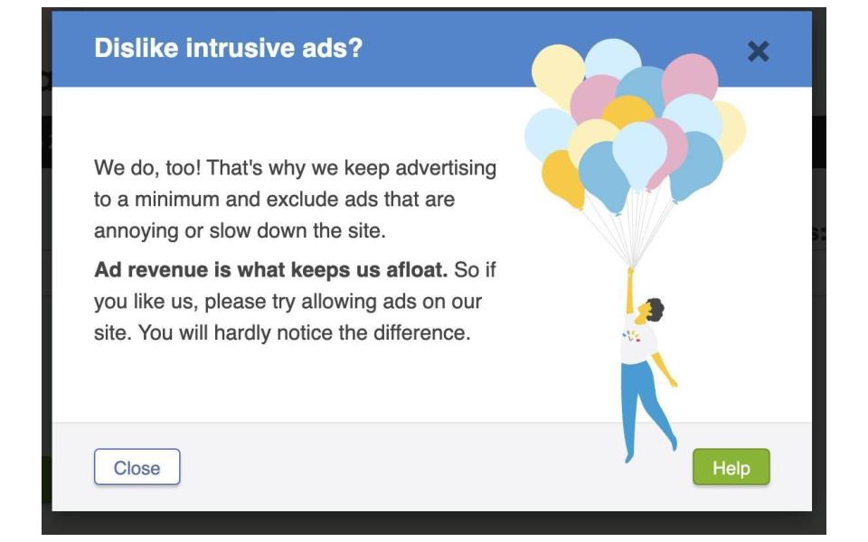
Showing empathy and honesty to the users helps a UX writer build trust, which is one of the goals of user experience writing. In the following example of an adblocker, UX writers work to get into the user’s shoes with a relatable heading that reads Dislike intrusive ads? In the body, the UX copy tells the user that the site uses and runs fewer ads to keep everything streamlined. The tone is pretty conversational and honest and might encourage the user to disable the adblocker without using a dark-patterned CTA.
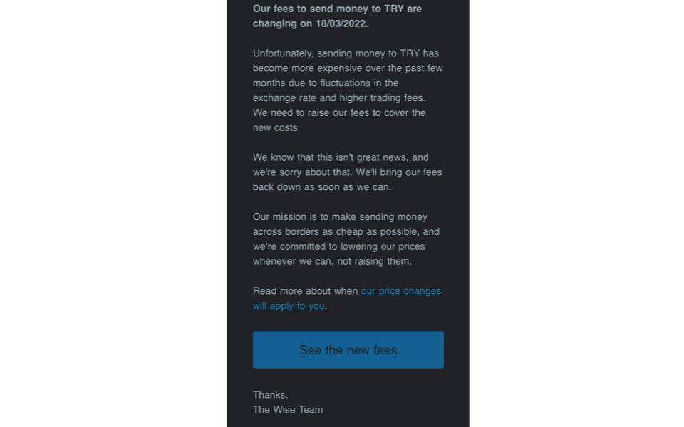
At times, it is the UX writer’s job to write email copy. In the following example, the email copy from Wise – a London-based financial technology company – informs the user about their rising exchange and trading rates using a humble tone. In the body, they tell the user that they feel sorry about this increase and will work on bringing their fees back down as soon as possible. They told the users about the increase in fees, but the users understand the reason and know what to do now and what to expect next. It is a great example of sharing unpleasant news with users.
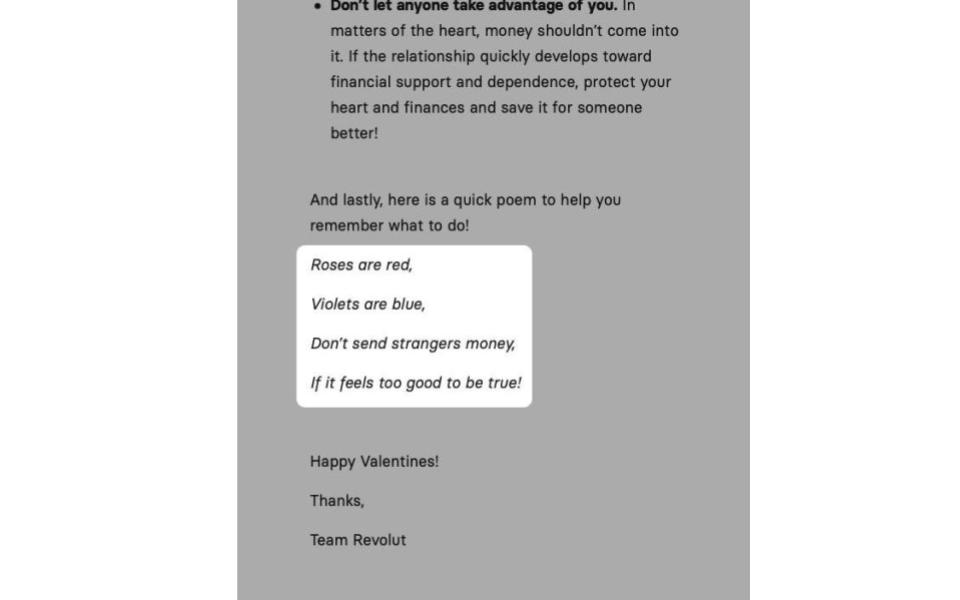
Revolut is a British financial technology company known to have a quirky brand voice. In this example, the company cautions its users of scams using a humorous poem. Though companies should use humor in a careful manner, it works great in the Fintech industry because of some reasons. The primary reason is that the brand’s voice is fun and creative. Another reason is that this email is just giving cautionary advice.
Here is another example of a dark-patterned CTA. The world’s leading online art gallery, Saatchi Art, tries to trick its users into subscribing to their email list with confirmshaming. It is an act of shaming users into acting in a different way than they would do in a normal condition. Here, it is the option to decline, which a UX writer crafts in such a manner as to shame the user into compliance.
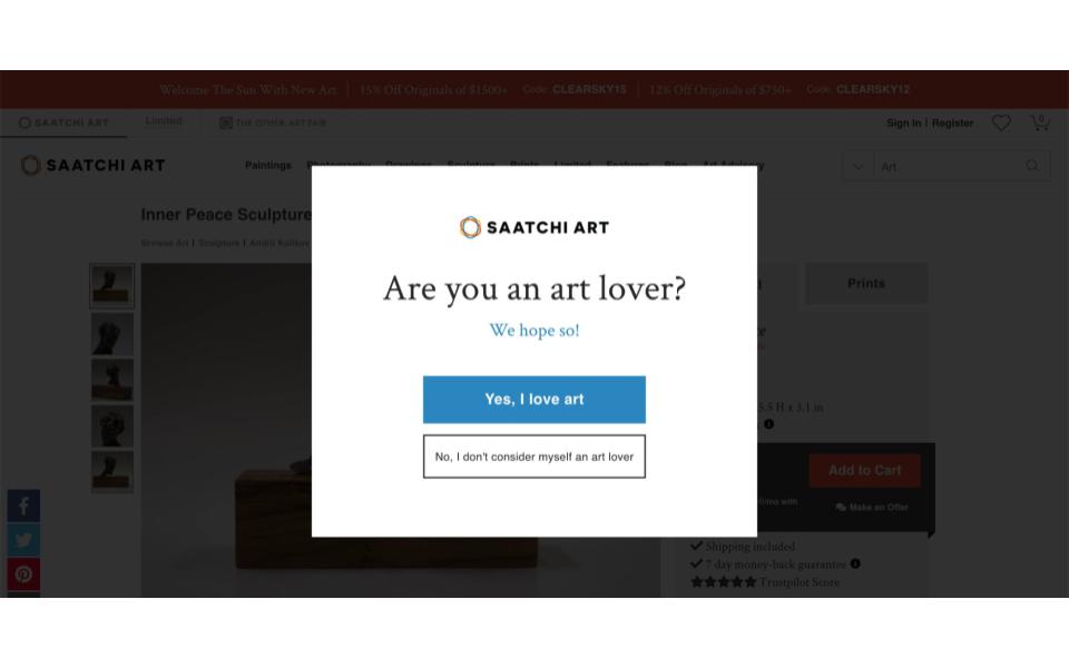
Making a user sign up for a mailing list is the most common use of this practice. Instead of the current copy, a UX writer should just say No. In most cases, brief and concise copy is the way to go with UX writing.
When it comes to the waiting time, UX writers can also get creative and inform users about what is happening in a fun manner. It is unfortunate that WordPress fails in this case. When WordPress users are in the process of installing a template for their site, they have to wait for a while. Users want to know what the current status of a system is for relief. Therefore, it is a bad idea to leave the user hanging.

Here, WordPress can use a better approach to inform the users which components of the template are ready. UX writers should inform the users all the time about what is happening through appropriate feedback within a reasonable time. When users know what the system is up to, they find out the result of their previous interactions and determine the next steps. Foreseeable interactions help build trust in the product and the brand also.
Are you looking to know the tactics to create a winning UX microcopy? Our UX writing course teaches the fundamental skills and practices to adapt in UX writing:
In a utopia, systems would load so fast that users would feel no need to see a loading message. However, it is different in the real world. While a system is loading, screens oftentimes show a boring copy to ask users to wait. UX writers can make the most of this place if they want to make users feel happy and connected.
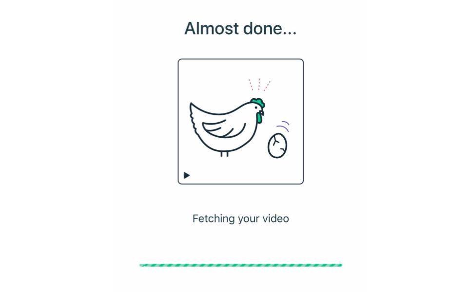
In this example, the online video editor Magisto is doing a splendid job with its copy. They inform users at each stage of the process what is happening, so there is no need for users to guess. It is one of the ten heuristics of UX to keep the system status known to the user. Therefore, it is important to provide a nice user experience.
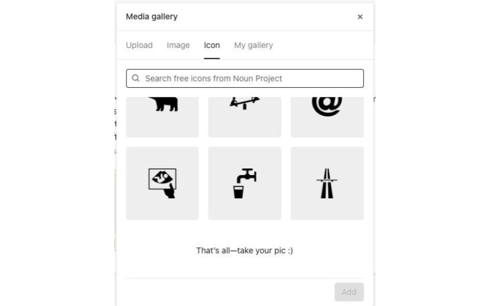
Typeform is an online SaaS platform with an eyesome copy. It appears when you reach the end of the list of available icons to choose from. They nudge users toward the action in a conversational manner than writing a plain and simple copy.
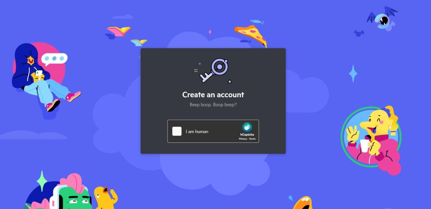
We all know that proving you are a human when logging in or signing up is a pain in the neck. But Discord tries to reduce some of that frustration with a playful microcopy that mimics a robot. Discord is a platform targeted toward gamers, so they use fun and interesting copy to connect to their audience.
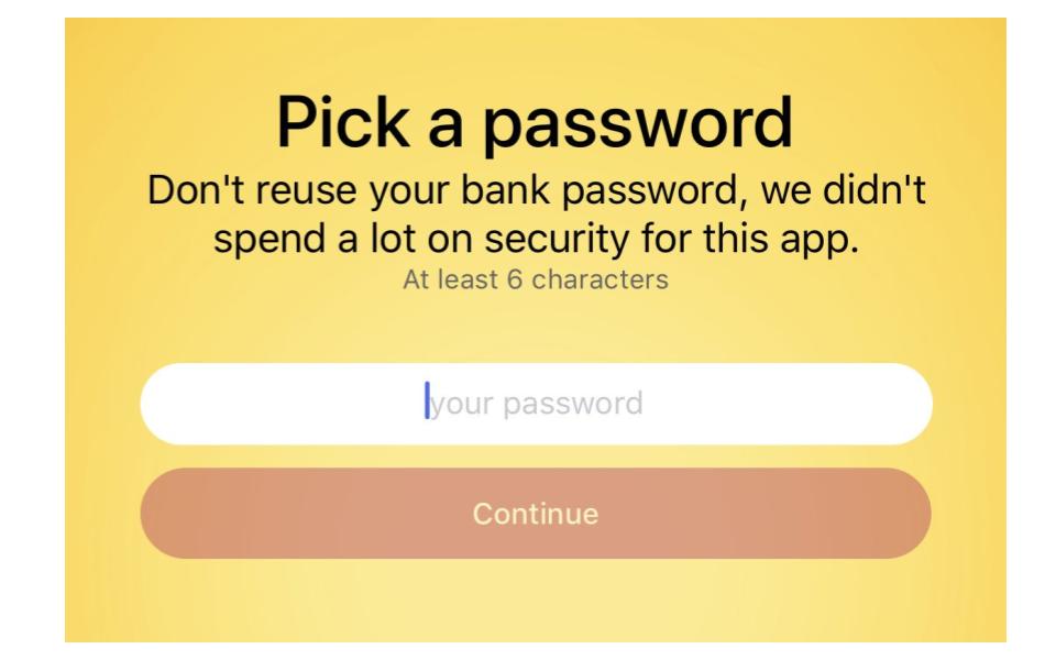
Following is another nice example of writing UI text during account creation. Many of us have a habit of reusing our passwords from different accounts. This website tries to deal with that issue in a creative way. Their humor and honesty make a fun experience out of it.
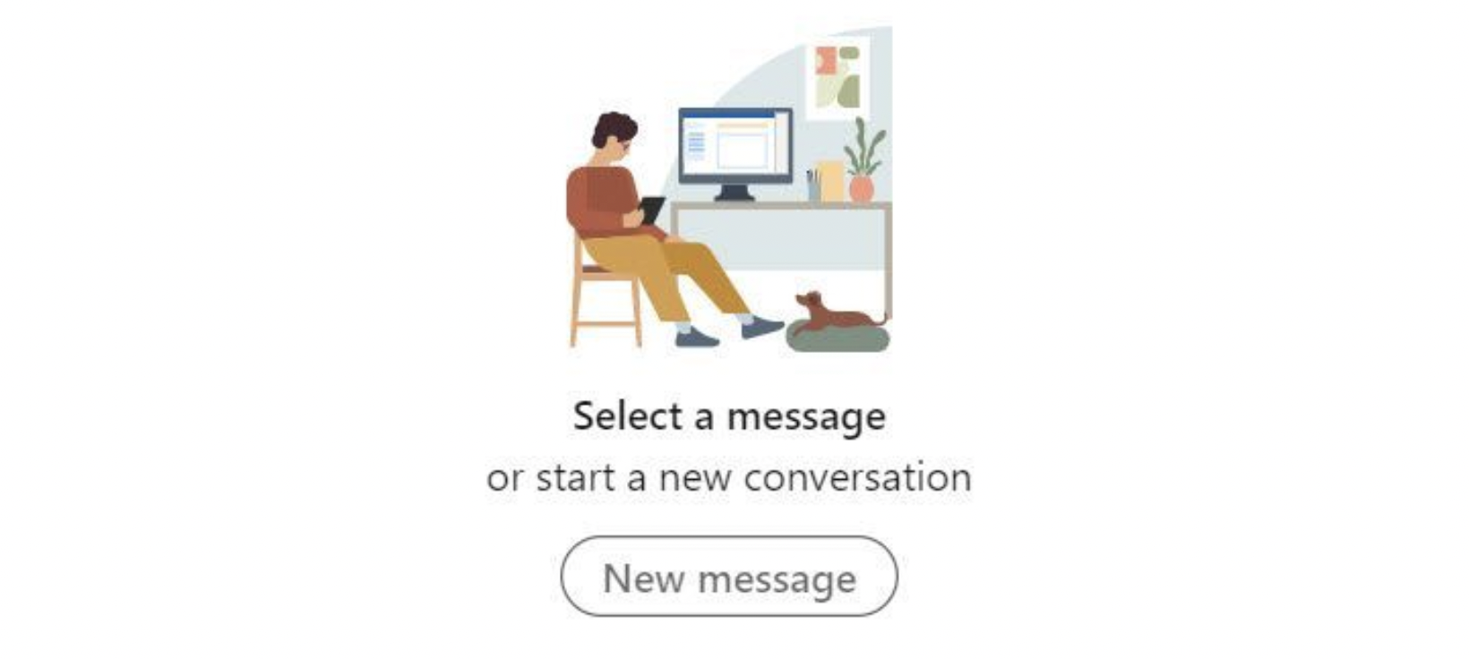
Here is an example of a nice empty state microcopy from LinkedIn’s messaging. With a pleasing illustration and positive language, it gives useful information with an actionable CTA. You can see that it is possible to achieve your goal yet with limited content. So, whenever UX writers struggle to come up with a different microcopy for a digital product, they should follow LinkedIn’s approach and try to keep everything as light as possible.
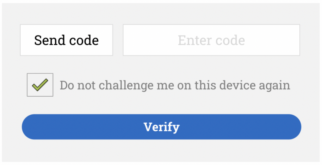
When communicating with users, it is the UX writer’s role to use their language and words. Users may find it confusing if UX writers use rare words. This is what happens in the following example during the verification process. You will also agree that Do not challenge me on this device again sounds pretty awkward. It may seem to the users that verification is a challenging process. In case it is, we would want to reduce any stress experienced by the users. A better approach that many UX writers follow is to write Remember this device in the future. With this copy, you can tackle this issue in a better way.
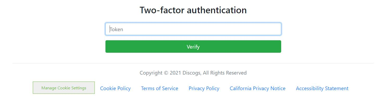
This is a poor example of microcopy. When a user lands on this screen, different questions like What is token? Where do I get one? goes through his mind. And the lack of microcopy will increase the user frustration. Their UX writers can follow a better approach, which is to inform users what a token is, where they can find it, or a placeholder with its format. This will answer every possible question in a user’s mind and make the entire user experience pleasant.
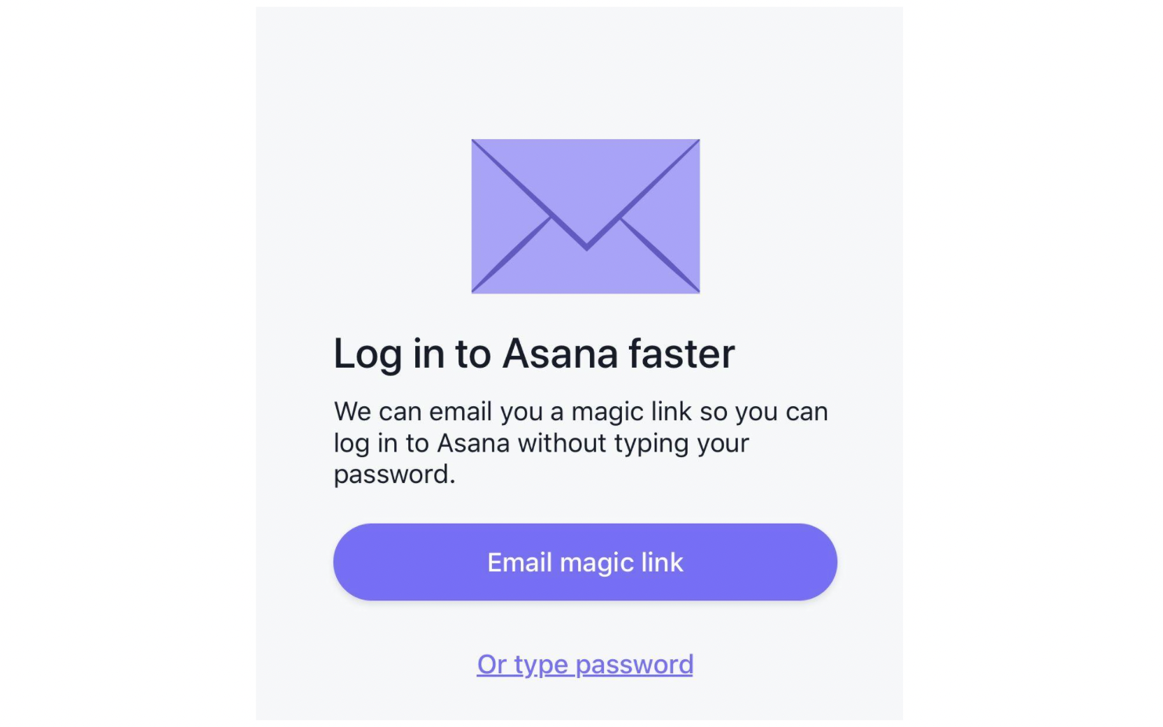
When using Asana, users get a magic link as part of the authentication flow during the sign-in process. They can use this link to log in to Asana faster without typing their password. Their copy is fun, concise, and helpful. It resonates with what they do, and the heading and CTA are apt.
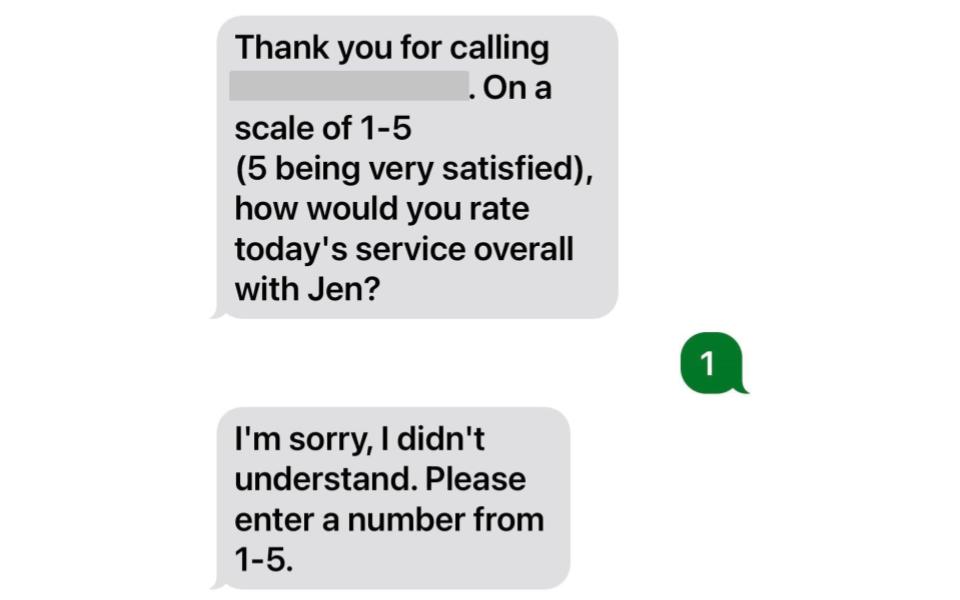
In addition to copy, the design also has great significance in user experience writing. A bad design is able to turn away users from your digital product. This is the case with the following chatbot script design. Since it expects to get 5 every time, the bot is unable to take 1 as an answer. For any user, remaining unsuccessful in giving the bot poor feedback is the last thing for sure. So, it is best for a UX writer and the design team to test the chatbot for every scenario before making it public.
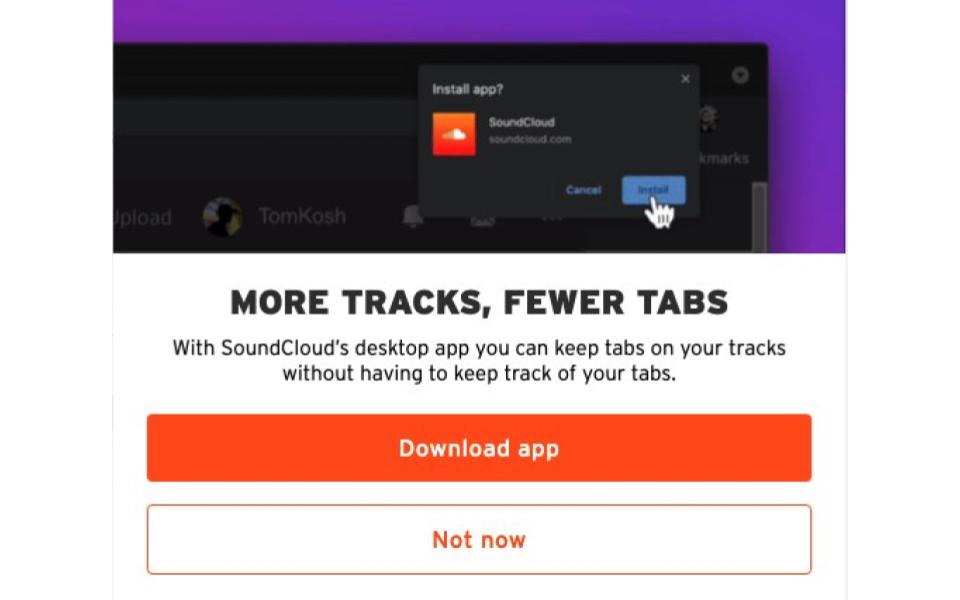
Soundcloud, a famous music platform, has a nice take on words to encourage users to download its app. Besides the clear heading, the body section contains a clever copy, which leaves the users awestruck.
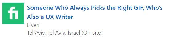
Many applicants find it frustrating to apply for a job. In this case, Fiverr does a great job by coming off as fun and refreshing to its potential recruits. In its job posting, it uses pop culture to connect with the applicants and give them a hint of what kind of experience they will have working on Fiverr, which is one of the world’s top job portals.
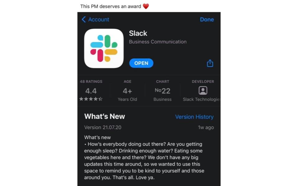
Slack, a proprietary business communication platform, boasts an amazing UX writing team, and their release notes show that. It talks to its users like a friend and reminds them that mental health is also important as people work without interruption in front of their screens. Instead of going with No Updates, it follows a creative approach and makes its users feel valued.
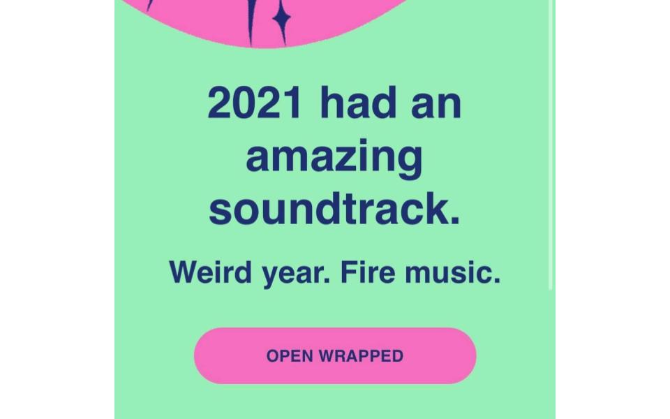
The Wrapped feature by Spotify – an audio streaming and media services provider – allows users to look back through their last year via songs and artists they listened to most. It is their way of telling users that no matter what happens, the music stays with them every time. Spotify focuses on the positive side, which every UX writer and product designer should do.
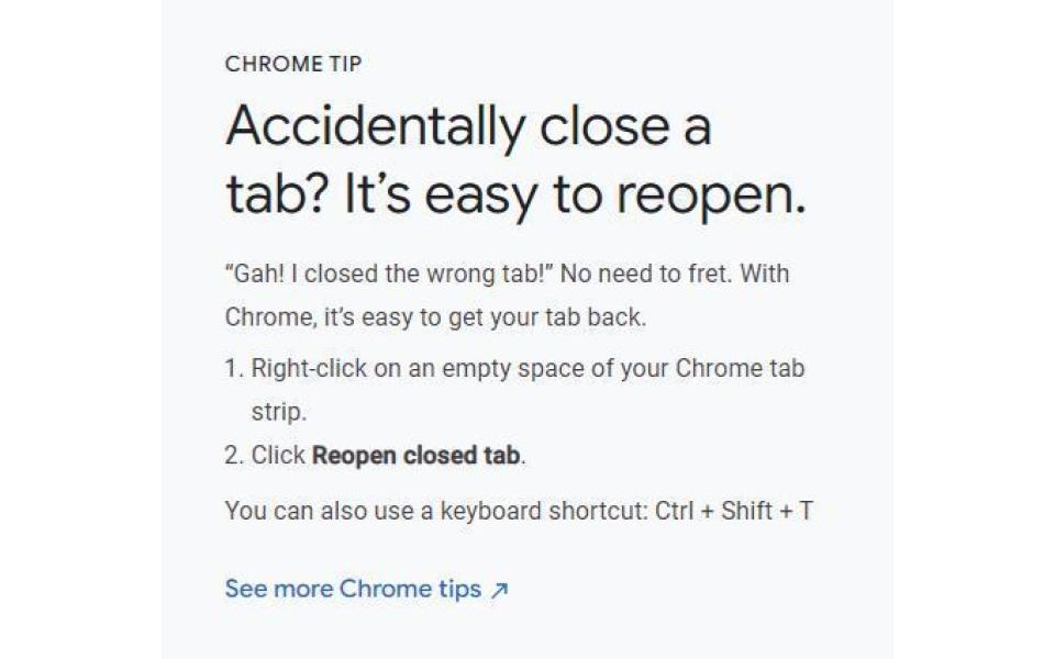
For those who close a browser tab by mistake, Google Chrome gives a tip on how to reopen that tab. It is evident from the headline that Google gets into the mind of its users and write what they think at this point. Also, the instructions are pretty clear. It also includes a keyboard shortcut and a link to see further Chrome tips. This microcopy shows that Google has honed its user experience writing.
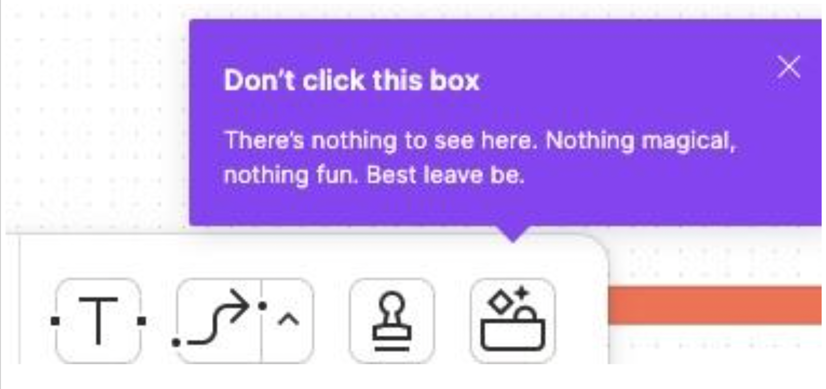
Here is a pretty interesting example of a microcopy. This app inspires curiosity in users to avoid trying the new feature. It follows a different and playful approach, which makes users curious to know what the feature is about and nudges them to try new functionalities.
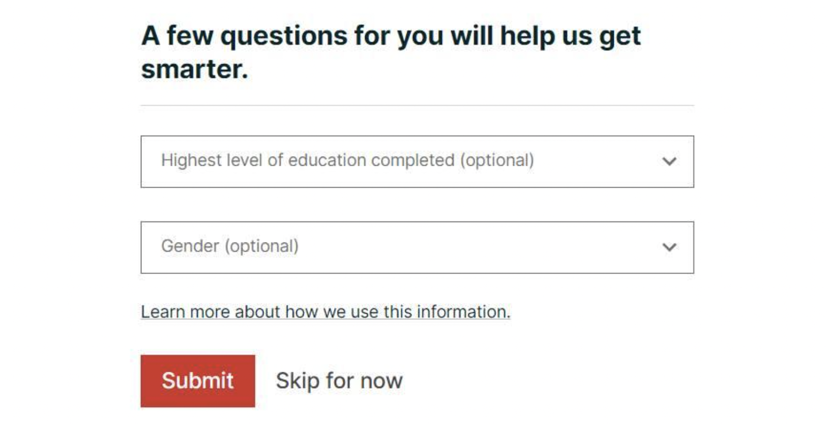
In the following example, the popular online learning platform edX asks users for personal data to help them get smarter. It is a fundamental job of a UX writer to focus on the customer’s benefit when writing copy. A UX writer can write a better copy to tell users that this data will help the platform improve the user experience.
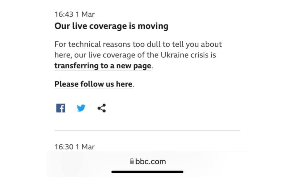
BBC – a popular news channel, should avoid coming off as condescending. However, in the following example, it does. The heading is unclear, and the body has a patronizing tone, which is quite different from its usual brand voice. Their UX writers can make the copy better by making the heading clear and using their usual tone in the body.
Twitter shows this brilliant microcopy when a user tries to share an unread article. They display this confirmation modal as they realize that these articles can mislead. Since the goal of Twitter is to share authentic news that is happening everywhere across the world, this confirmation microcopy by their UX writers is great for keeping the platform as authentic as possible. The heading is clear, the body is to the point, and the CTAs are quite useful.

A therapy application should know that an offensive microcopy like this can damage somebody’s mental condition. Instead of writing such demotivating copy, UX writers should write something like You are still doing great. This sounds positive, motivating, and reassuring.

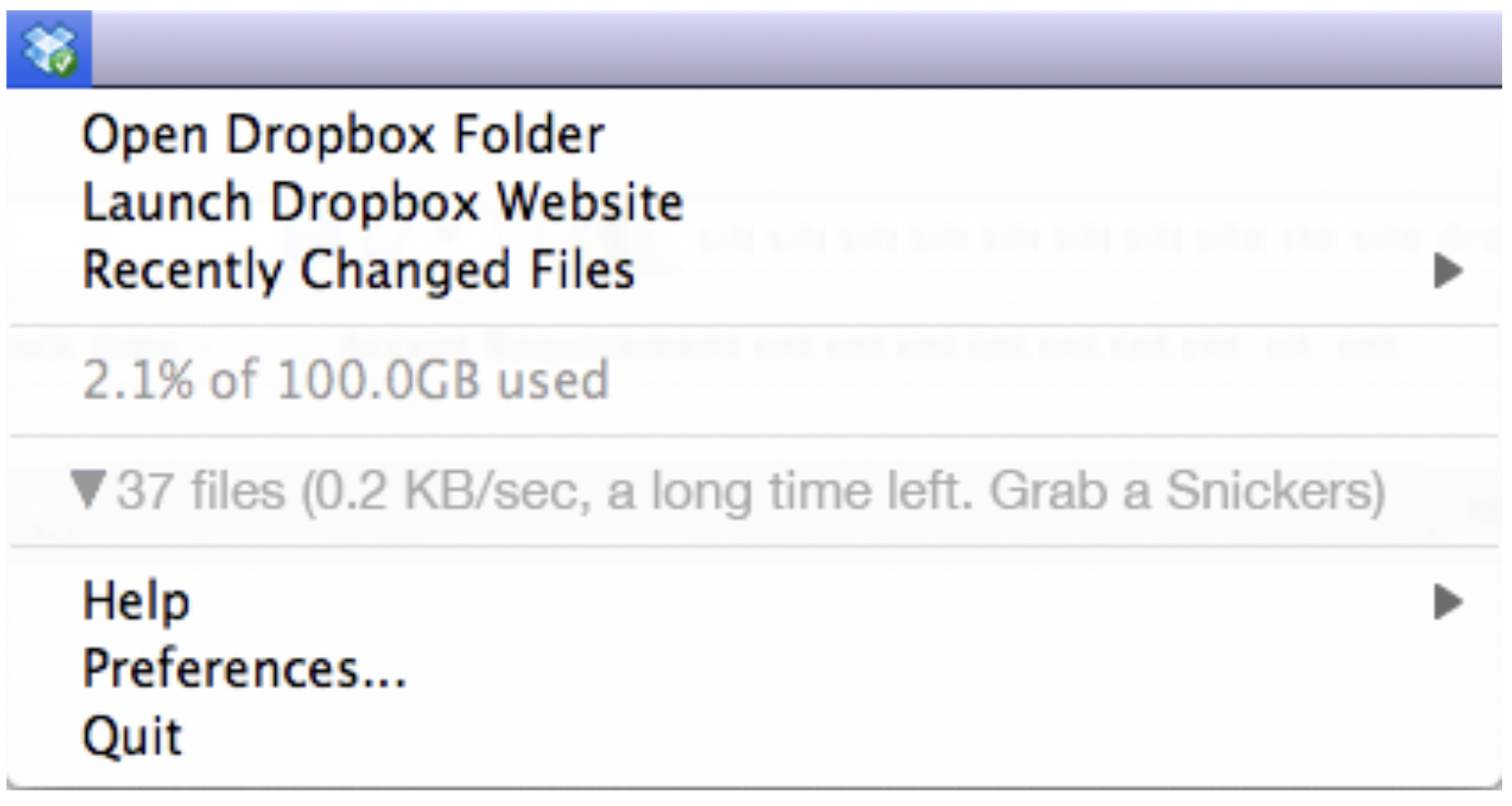
Like Slack, Dropbox likes to have fun with its writing. During the file transfer, many of us find it difficult to wait and do something else to kill time. Dropbox makes it a fun experience by telling users to grab a Snickers while they wait for the process completion. It is one of the best waiting time microcopies you can find out there.
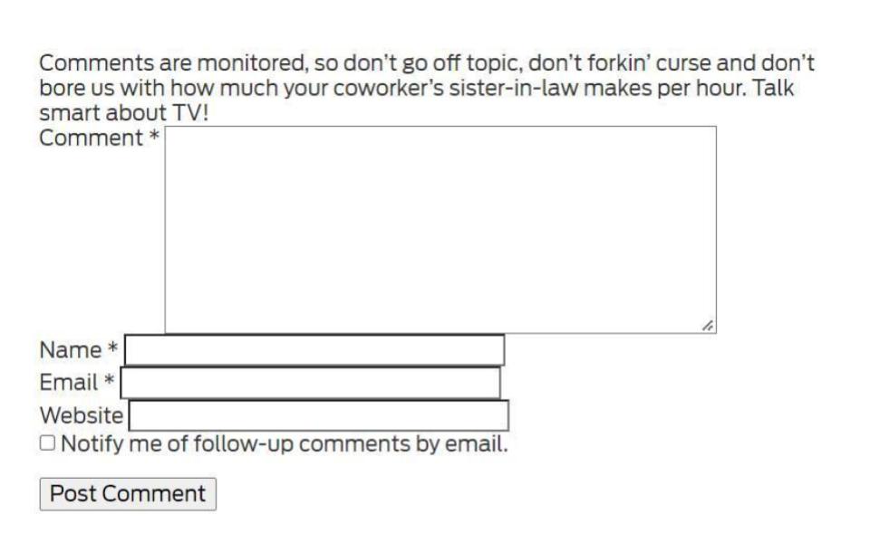
The following TVLine.com microcopy, above the Comment section, tells the users to avoid talking on topics that are irrelevant to TVs in a fun way. This copy promotes engagement in the comment section for sure. And users will also find their CTA nice as it says Post Comment, unlike the classic Submit button.
Shutterstock, a royalty-free images website, does it right with its amazing wordplay. Using puns is great to capture the audience’s attention then and there, but UX writers should keep localization in mind when doing it.

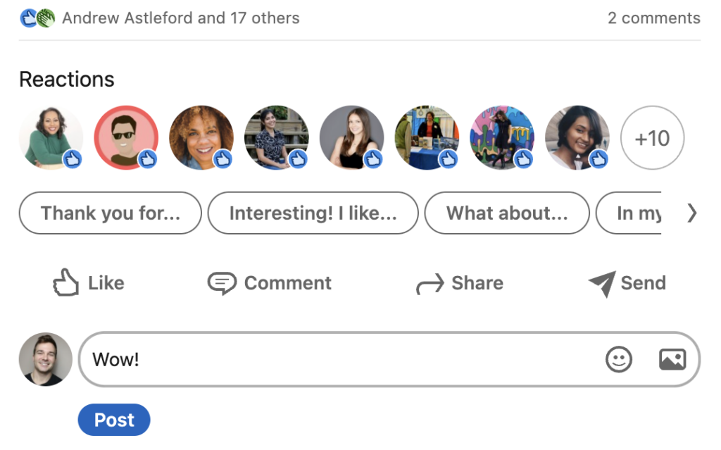
UX writers can make the most of their words if they get creative with placeholders on 404 pages, waiting times, and empty states. In this case, LinkedIn encourages the users to type comments by provide comment intro suggestions including Thank you for…, Interest! I like…, What about…, and more
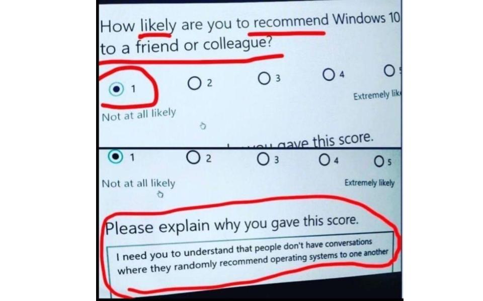
Microsoft is a multinational technology corporation, but it needs to put some work into its UX writing. There are some places where Microsoft can work much better. Considering the following example, talking about operating systems with friends or colleagues happens at rare events. Instead of writing this copy, the UX writer can go with something like Do you think Windows 10 would be a great OS for your friends or colleagues?
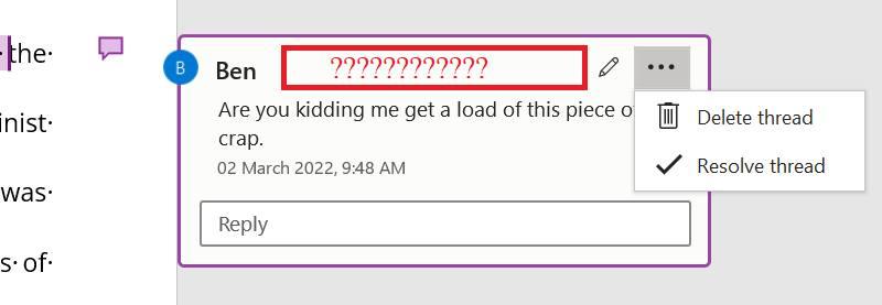
Another bad example from Microsoft is the poor design of the content. Here, Microsoft has put the Delete and Resolve options in the menu. The edit button takes up most of the space and resolves a comment from milliseconds to seconds. UX designers improve the flaws in the design process by putting the edit option inside the comment section and the Delete and Resolve threads at the top.
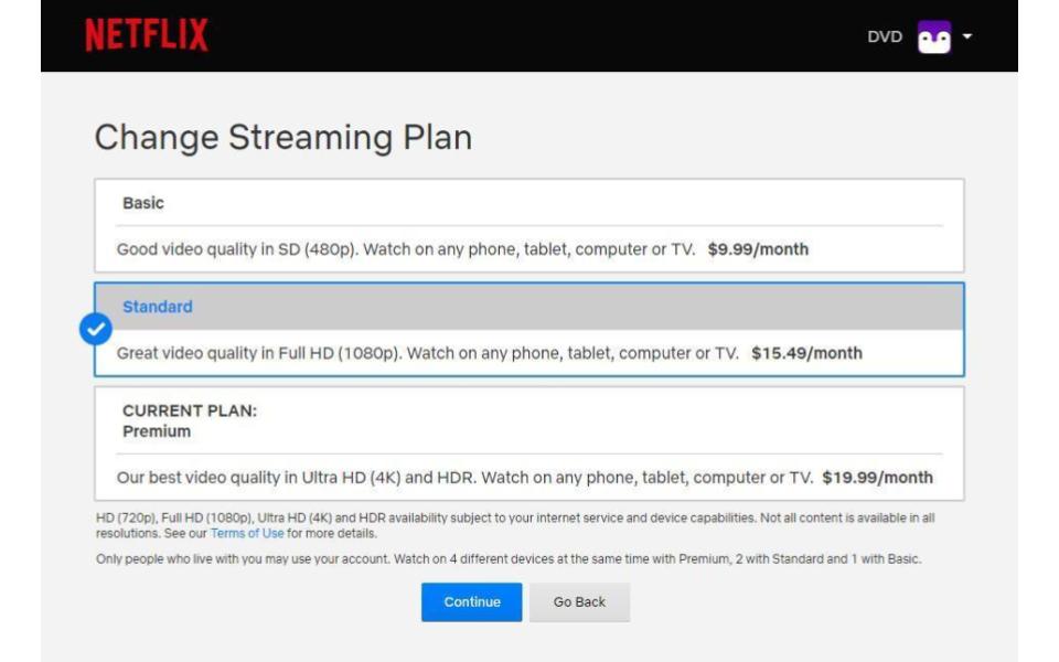
Another design flaw example comes from one of the biggest content streaming platforms, Netflix. It shows how much copy placement matters. The plans focus on video quality instead of device limits. But the device limits are applicable, and this information is available on this screen. If Netflix hides such information on purpose, then it falls under the dark pattern, which is unexpected from such a platform. Here, UX writing can get better by including device limit information under the Current Plan to make it easier for a user to know how many devices they can use on their plan.
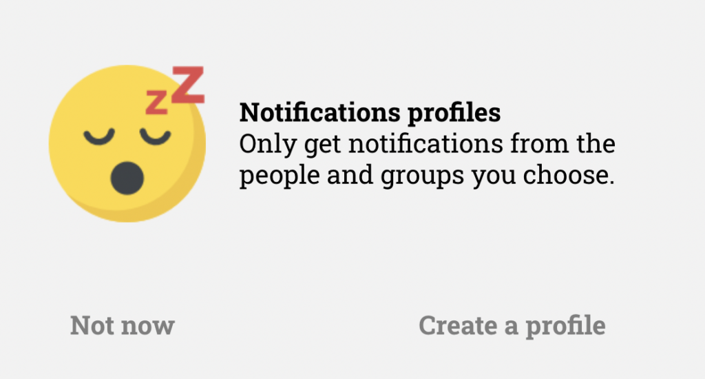
Signal, the instant messaging service, allows users to choose which people and groups to get notifications from. Also, it does a good job communicating the benefit of creating a profile in a simple yet effective way.
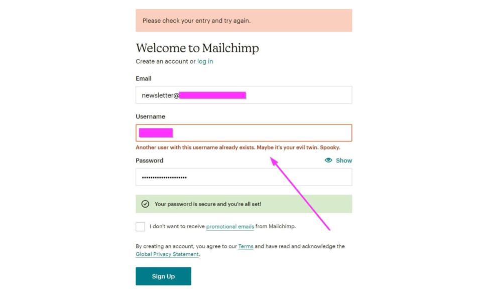
Mailchimp, the marketing automation platform, is a good UX writing example for the way it uses voice and tone in its products. During the signup process, Mailchimp channels its playful and humorous side. When a user enters a username that matches with some other user, the copy tells that this username already exists in a pretty cool way.
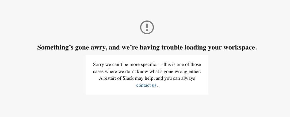
Here is another example of UX writing by Slack. This is an error messages copy, which is written in a fun yet professional way. Slack stays conversational here like they do and inform the user that they are also unfamiliar with the cause of the error. In the UX writing microcopy, the UX writer has also shared troubleshooting steps along with a link to contact Slack.
If you want to improve fast, don’t just screenshot these. Use them as a practice set.
Pick any “bad” example above and rewrite it in two versions: one purely clear, and one clear plus on-brand. Then ask a friend which one makes them feel more confident.
If you want a structured skill checklist, I use UX writing skills as my personal baseline.
Choose one scenario, like error messages or onboarding, and create a tiny case study: problem, constraints, before copy, after copy, and why. This is exactly the type of work that lands well in portfolios, and you can see the pattern in UX writer portfolio examples.
Patterns help, but process keeps you consistent. If you want deeper practice material, I recommend bookmarking UX writing books and pairing one book with one real flow you can rewrite.
If you want a structured path, my UX Writing Certification Course is built around building portfolio-ready work.
If the user is anxious, angry, confused, or impatient, your copy needs to respond to that reality. That’s where empathy, encouragement, and timing become practical tools, not fluffy ideas.
If you want research-backed principles, Baymard’s writing on validation errors is a great place to learn what makes recovery copy actually work in forms.
The best UX writing examples don’t win because they are clever. They win because they respect the user’s goal, reduce uncertainty, and create momentum at the exact moments users get stuck.
If you want one simple habit to steal from this article, it’s this: write the next step into the interface. When users know what to do next, most UX problems get smaller.
Here, I will answer the most frequently asked questions about UX writing.
UX writing is the in-product copy that helps users navigate interfaces, complete tasks, and recover from errors. It includes labels, instructions, onboarding text, confirmations, and error messages.
Common scenarios include signups and logins, form guidance, error messages, empty states, confirmation dialogs, subscription flows, notifications, and onboarding.
Good microcopy is clear, concise, user-centered, and consistent. Great microcopy also matches the user’s emotional state and provides the next step when the user is uncertain.
Yes, but it should be intentional and appropriate to the brand and context. Humor is risky in high-stakes moments like payments, security, or mental health scenarios.
Practice rewriting real flows, test your copy with users, and build a portfolio of case studies. A book or course can help if you want structure, but real feedback is the fastest teacher.
Pick one scenario, rewrite it with clear reasoning, and present it as a case study with context and constraints. Hiring managers want to see decision-making, not just pretty words.
Get the weekly newsletter keeping 23,000+ technical writers in the loop.
Learn UX writing and advance your career.
Please check your email for a confirmation message shortly.


Get our #1 industry rated weekly technical writing reads newsletter.
Your syllabus has been sent to your email