
Our reviewers evaluate career opinion pieces independently. Learn how we stay transparent, our methodology, and tell us about anything we missed.
Our reviewers evaluate career opinion pieces independently. Learn how we stay transparent, our methodology, and tell us about anything we missed.
In 2014, I wrote documentation that was technically correct but still failed users because the structure was confusing and the content was stale. I remember watching a teammate try to find a basic “reset password” article, give up, and message support instead. That moment made me take knowledge bases seriously as a user experience system, not just a publishing project.
These days, when I review a knowledge base, I’m looking for the same things every time: strong content categorization, a knowledge base search engine that works, and a clear path to self-serve help articles without getting stuck.
I’ll walk through seven knowledge bases I think are worth studying, and I’ll explain what I’d steal from each one. Along the way, I’ll also cover the benefits of running a knowledge base well, the mistakes I see most teams repeat, and the trends that are reshaping self-service support.
If you want the foundational definition first, read my guide on what a knowledge base is. If you want the structural layer that makes any KB easier to navigate, my breakdown of information architecture is the piece I come back to most.
A good knowledge base becomes a centralized information hub that shortens time to answer for both customers and internal teams. When users can self-serve, your support team gets fewer repetitive tickets and more time for issues that actually need a human.
It also creates consistency. When procedures live in one searchable knowledge repository, you stop getting five different answers depending on who someone asks, which is why knowledge bases are often the fastest path to a real single source of truth.
Here I’ll go through the biggest benefits of having an effective knowledge base.
Every great knowledge base begins with a strong search functionality. This includes a prominent search bar, relevant results, and ideally, predictive search features that help users refine their queries before hitting enter.
Content organization should feel intuitive. Categories and articles need to align with user intent rather than internal organizational charts. The best systems incorporate FAQ navigation features and internal linking to guide users effortlessly through the content.
Modern knowledge bases are increasingly evaluated on their accessibility and mobile-first design. Features like keyboard navigation, reader compatibility, and optimized mobile access are essential, especially for users looking up answers while mid-task.
Next, I’ll list best practices for creating a knowledge base.
Knowledge base management should be approached as a long-running product, not a one-time documentation sprint. This includes starting with article templates and formatting guidelines that ensure consistency, even when multiple writers and SMEs are involved.
Maintenance is essential. Content updates should follow a regular schedule and workflow, making “regular updates” a normal process rather than a heroic effort. Without this, the knowledge base risks becoming an outdated archive that users no longer trust.
Alignment is the third essential pillar. The best knowledge bases integrate team communication and support feedback to ensure the content reflects what users actually ask about, not just what the company hopes they ask.
If you want a deeper platform-level breakdown, I keep a current guide to knowledge base software. If you want the writing craft itself, knowledge base documentation is where I lay out how I structure and maintain articles.
Here you can check the most common mistakes people make when designing a knowledge base.
One of the most common failures is creating a knowledge base that looks polished but lacks essential pages. Teams often focus on publishing “happy path” content while neglecting troubleshooting, edge cases, and task-specific guidance that users need.
Overcomplicated designs with excessive elements can hinder usability. Instead of helping users find answers quickly, cluttered pages make the knowledge base difficult to navigate, especially on mobile devices.
While your tone and design should align with your brand, clarity should never take a backseat. A simple page that solves the problem is far more effective than a visually fancy layout that slows users down.
Finally, I’ll go over emerging trends I’m noticing lately.
AI-powered chatbots are increasingly common, but the best implementations use them as an entry point rather than the sole support strategy. Users still require reliable articles to back up the chat experience; otherwise, the bot risks confidently delivering incorrect answers.
Smart search is evolving with features like search suggestions, intent matching, and content delivery tailored to user type and history. When executed well, this functions as a role-based guidance system, enhancing user navigation and satisfaction.
Mobile-friendly knowledge base design is now the standard. Optimized layouts, mobile-first design principles, and on-demand in-app AI-powered self-help are becoming as critical as desktop navigation, especially for products frequently used on the go.
If you do not measure, you end up guessing. I usually start with search metrics, like search success rate and “no result” queries, because those reveal content gaps faster than almost anything else.
Then I look at behavior metrics, like time on page, exits, and internal link clicks. Those insights tell you whether users are actually completing tasks or just bouncing around frustrated.
Finally, I tie it back to outcomes: ticket deflection, time-to-resolution, onboarding time, and customer satisfaction. A knowledge base is not a vanity project, so your key performance indicators should prove it is reducing work and improving support.
A well-designed knowledge base helps users understand your product or service, reducing the need for human support. To support this goal, we’ve compiled seven excellent knowledge base examples in this section.
Let’s review some of the best knowledge bases and see what you can learn.
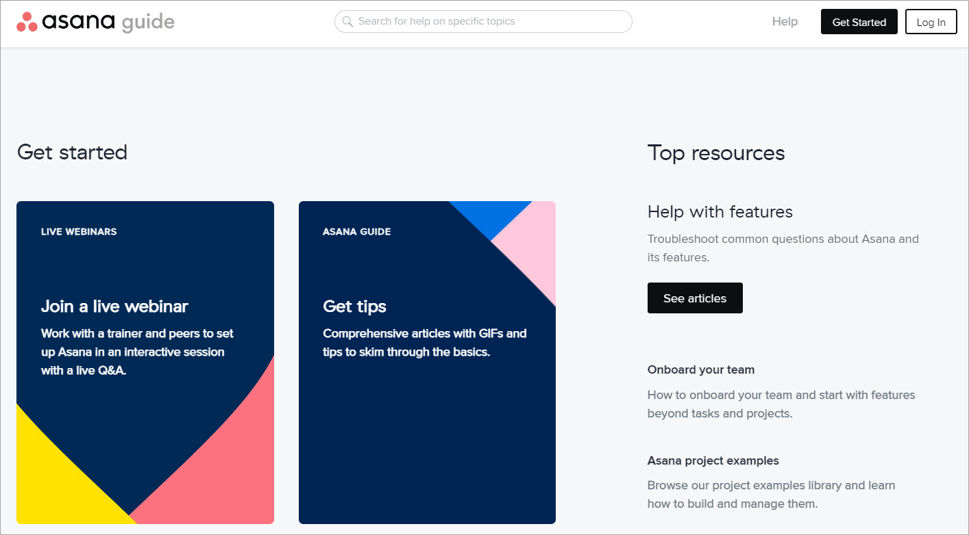
Asana’s guide is one of my favorite examples of content categorization that still feels human. Instead of only relying on articles, it blends self-serve help articles with webinars, video tutorials, and courses, which supports different learning styles without forcing everything into the same template.
What I’d copy is the way it reduces friction. The navigation feels predictable, and the structure makes it easy to jump to the right section without scanning a giant wall of text.
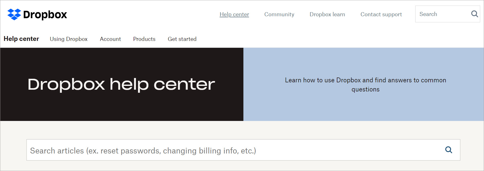
Dropbox is a strong example of user-centric design that stays simple. The search bar is prominent, the paths are clear, and it does not bury “contact support” behind five clicks, which matters when self-service fails.
What I’d copy is the balance between browsing and search. It supports users who want to navigate categories and users who want to type a question, which is a practical way to serve different behaviors.
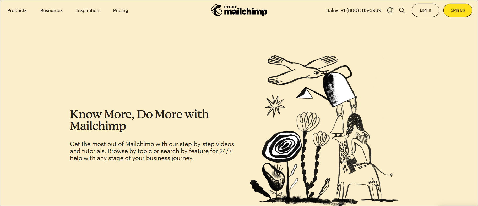
Mailchimp is great at guiding users toward the highest-demand content first. It surfaces popular guides and tutorials, then backs it up with visuals that make complex steps easier to follow, which is especially useful when your audience is not technical.
What I’d copy is the feedback loop. When you can collect feedback on article usefulness, you can improve content faster and turn knowledge base insights into a real improvement cycle.
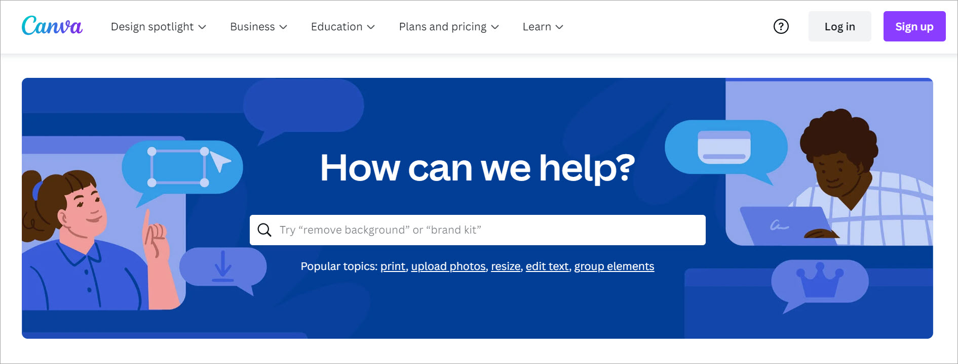
Canva’s knowledge base is a clean example of “design supports clarity.” The categories are easy to scan, the search experience is improved with suggestions, and the overall layout feels optimized for quick task completion.
What I’d copy is how it matches the product audience. Canva leans into visual elements because that’s how its users learn, but it still keeps the structure straightforward and easy to navigate.

Buffer’s support content is a reminder that branding can work with usability instead of fighting it. The tone is friendly, but the real win is how the content is organized into clear product areas, which reduces confusion for users who are trying to figure out “where does my problem belong.”
What I’d copy is the emphasis on step-by-step flow and video support. For products with lots of workflows, a clear progression plus visual reinforcement reduces repeat questions fast.

Shipt is a strong example of a searchable knowledge base that leans into question-based structure. The layout makes it easy to find common questions quickly, and the built-in feedback options give users a way to say “this didn’t help” without rage-quitting the page.
What I’d copy is the combination of self-service support and escalation paths. It respects user time by making it obvious what to do when the KB does not solve the issue.
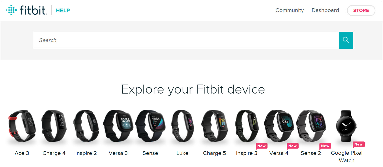
Fitbit’s device-based organization is a smart form of role-based guidance system. If your users have different products, grouping by device helps people find the right answers without learning your entire taxonomy first.
What I’d copy is the community forum integration angle. When done well, a user community complements official docs, especially for edge cases and real-world tips that do not belong in core product documentation.
Here are some of the top technical writing courses you can check out to strengthen your writing and documentation skills.

If you study these examples with a critical eye, you’ll notice a pattern: the best knowledge bases are not just “well written.” They are structured around user intent, built for fast retrieval, and maintained like a living system.
If you want to build something comparable, start with information architecture, lock in templates and workflows, and measure what users search for. Then iterate until your knowledge base feels like the fastest path to an answer, not another place users get stuck.
Here, I answer the most frequently asked questions about knowledge base examples.
A good knowledge base is easy to search, easy to browse, and consistently maintained. Users should be able to find answers quickly without needing to understand your internal company structure.
There is no perfect number. I focus on coverage of top support questions, clear categorization, and filling content gaps revealed by search logs and support tickets.
AI-powered chatbots can help, but only if the underlying articles are accurate and well-structured. A chatbot should guide users to the right content, not replace the discipline of knowledge base management.
Track search success rate, “no results” queries, and feedback on article usefulness. Then connect those to outcomes like ticket deflection, time-to-resolution, and onboarding speed.
They publish content without a plan for maintenance. Once users hit outdated content, trust drops fast, and your knowledge base stops being a self-service tool and turns back into a support burden.
Get the weekly newsletter keeping 23,000+ technical writers in the loop.
Learn knowledge management and advance your career.
Please check your email for a confirmation message shortly.


Get our #1 industry rated weekly technical writing reads newsletter.
Your syllabus has been sent to your email