Our reviewers evaluate career opinion pieces independently. Learn how we stay transparent, our methodology, and tell us about anything we missed.
Our reviewers evaluate career opinion pieces independently. Learn how we stay transparent, our methodology, and tell us about anything we missed.
Back in 2014, when I started my technical writing career, I learned a painful lesson fast: clarity does not matter if users cannot locate the page in the first place. I’ve seen “good docs” fail because the navigation, labels, and taxonomy were built around internal team language instead of how real people search.
Information architecture became my cheat code. Once I started treating structure like a product feature, everything improved, including onboarding docs, help centers, and internal knowledge bases.
I’m going to walk through the core parts of IA the same way I approach them on actual doc and knowledge base projects. Think of this as a practical checklist you can apply whether you’re building a help center, redesigning an intranet, or cleaning up a messy wiki.
Information architecture is the difference between “users can self-serve” and “support is drowning.” When the structure is predictable, people move through content with less friction, and you reduce cognitive load because they do not have to guess where things live.
This is straight cognitive psychology in practice. When content labeling aligns with user mental models, people spend less time translating your system into their own language and more time completing the task they came for.
It also quietly affects business outcomes. Better findability improves task completion, lowers support tickets, and helps product teams hit usability goals because the content system stops fighting the user’s expectations. Even government digital teams call out IA as a trust-builder because it helps people find what they need quickly and confidently through clear organization.
On mature teams, IA is also where business objectives and user research meet. Stakeholder interviews help you understand what the org needs, but user navigation data and usability feedback tell you what people actually do, which is where the real design decisions should land.
If you’re building this inside a broader program, IA gets even more important once you move beyond “docs” into a full knowledge ecosystem. I pair IA work with the same thinking I use in knowledge management basics and in a knowledge management system implementation.
When I explain IA to stakeholders, I keep it simple: organization, labeling, navigation, and search. That’s the system, and the system is what makes content usable at scale.
Organization systems are how you group and relate content, including hierarchies and “weblike” cross-links that reflect how people actually explore. This is where you decide your content structure and organization, along with the site structure people feel when they move through your pages.
A common trap is mirroring the company org chart. Your organisational structure is not your user’s mental model, so if you force it into the architecture, you create confusion and extra click depth.
Labeling systems are the words people see, and this is where ambiguous terms create instant confusion. If your categories are vague, users hesitate, and hesitation is friction.
I try to treat labels like a UI. They need to be consistent, specific, and predictable so users can scan and decide quickly without rereading a navigation menu three times.
Navigation systems are your visible pathways, like core navigation links, browse interfaces, breadcrumbs, and local navigation within a section. Even the best content inventory cannot save you if the hierarchy of menus buries key tasks.
I also pay attention to page templates because they influence how navigation elements repeat. A consistent page type or template helps users learn the layout once and reuse that knowledge everywhere.
Search systems are your fallback, and they matter more than most teams admit. If search utilization is high, it can mean users love search, but it can also mean your navigation structure is not doing enough work.
I also watch for “search loops,” where users search, click a result, hit a dead end, then search again. That is usually a labeling or grouping issue, not a search algorithm issue.
I keep Dan Brown’s principles in the back of my head whenever I review an IA. The ones I use most often are the principle of choices (reduce options), disclosure (show enough to orient someone), exemplars (use specific examples), front doors (assume people enter anywhere), multiple classification (people browse differently), and growth (design for scale).
In practice, this means I design for “predictable structure” more than perfect structure. Users forgive small imperfections when the pattern stays consistent, but they do not forgive surprises in the hierarchy of menus or random category logic.
The principle of focused navigation is one I lean on when the content set is huge. The goal is not to show everything, it’s to show the most likely next step, so wayfinding stays smooth.
I also try to avoid dead ends by treating every page as a “front door.” People land from Google, Slack, or a ticket link, so each page needs clear orientation and a few obvious paths forward.
I keep content chunked into modular units because it reduces cognitive load and improves scanning. It also makes maintenance easier, because you can update a single unit without rewriting an entire guide.
When teams complain their docs are “too long,” the real problem is often that the IA and chunking are doing too little. A strong structure makes long content feel shorter because it is easier to navigate.
Most of my IA work starts with a content inventory because you cannot organize what you do not understand. I usually build a content inventory document in a spreadsheet, then look for duplication, stale pages, and orphaned content that creates information overload.
Once I can see the full content set, categorization becomes a pattern-finding exercise. I look for logical functional groupings that match user tasks, not internal team ownership.
If the team already has a controlled vocabulary, I align to it. If they do not, I propose a lightweight one because uncontrolled terms tend to explode once multiple authors start publishing.
Next, I validate categories through lightweight user research. Card-sorting exercises are great when you need to discover how users naturally group content, and tree testing is great when you want to test whether users can find things in a proposed hierarchy without any UI design getting in the way.
I also like stakeholder interviews here, not because stakeholders define the taxonomy, but because they reveal constraints. If legal needs certain labels, or support needs a predictable structure for macros, it is better to know early than discover it after launch.
Then I move into models and prototypes. Even simple site diagrams and a basic site map can reveal problems early, like categories that are too broad, labels that are too similar, or a click depth that makes important tasks feel buried.
When the system includes dynamic data elements like autogenerated release notes or API references, I also sketch data modeling at a high level. It keeps the architecture realistic, especially when content is created programmatically rather than written page by page.

Taxonomy sounds academic, but it is just your classification system made explicit. The taxonomies I see work best combine a clean hierarchy with metadata standards and controlled vocabularies, so content stays consistent across channels and teams.
The biggest mistake I see is using ambiguous terms as categories. If you have “General,” “Resources,” or “Other,” you are basically admitting your system has a junk drawer, and users will feel that friction immediately.
When the content volume is high, I lean on labeling systems, tags, and consistent metadata. That gives you multiple classification paths, which is important when users have different mental models depending on their role.
IA and UX are tightly linked, but they are not the same thing. UX is the overall experience, while IA is the underlying logical structure that supports wayfinding, usability, and findability.
In real projects, IA overlaps with content strategy, information design, and even library science. It also overlaps with technical writing because we often own the information retrieval problem, not just the “writing” part of the work.
UX design often owns flows, screens, and interaction patterns. IA owns the classification and navigation logic that makes those experiences coherent across time, content types, and channels.
If your UX looks polished but users still cannot find things, that is usually an IA failure. The UI can be beautiful, but the system blueprint underneath it still has to make sense.
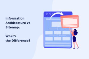
If you want a practical comparison, I’ve seen confusion melt away once teams understand the difference between an IA and the artifact people often mistake for it. That’s why I like pointing people to information architecture vs sitemap when the conversation gets stuck.
A dedicated information architect is great, but IA is usually a team sport. UX designers, content strategists, technical writers, and product folks all influence the final system, whether they mean to or not.
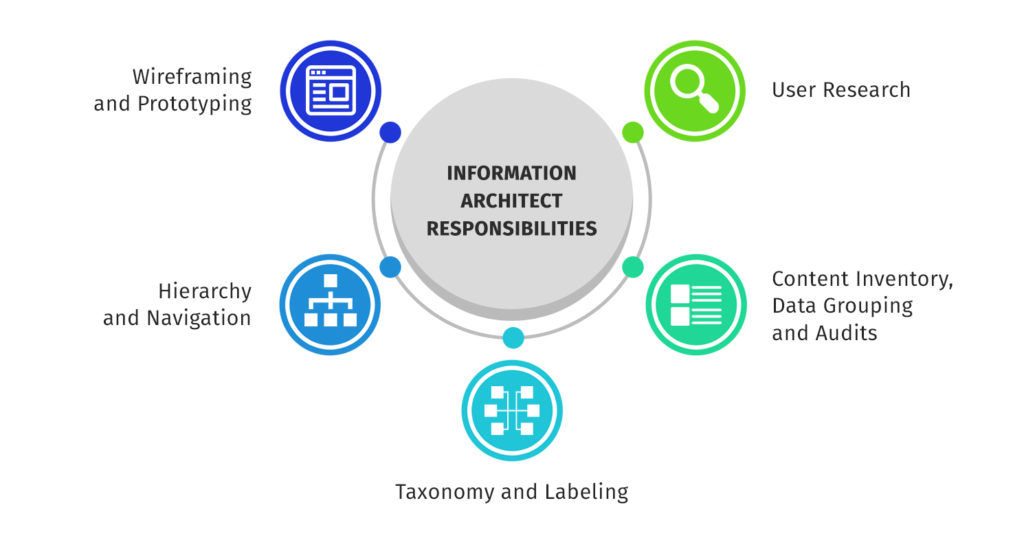
I treat the information architect role as the person who owns structure decisions and keeps the system coherent. That includes facilitating card sorting, running stakeholder interviews, defining labeling rules, and making sure the organisational structure does not accidentally become the user navigation.
If you’re building a knowledge-heavy environment, a knowledge manager often ends up owning IA outcomes too. In that world, IA becomes part of the job, not a nice-to-have, which is why I often connect it to knowledge manager skills.
Tools do not replace good thinking, but they make IA visible, shareable, and easier to maintain. The moment you can show someone a site map, a navigation flowchart, or a draft taxonomy, feedback becomes concrete instead of philosophical.
For most teams, Figma is the easiest place to collaborate because it is already in the design workflow. I use it for quick site diagrams, labeling experiments, and lightweight prototypes when we need to show structure without building a full UI.
If we need a more workshop-style space, FigJam works well for card sorting outputs, storyboards, and aligning on content categories. It keeps everything in one place, which matters when you’re collecting feedback across UX, docs, and support.
When the architecture gets complex, dedicated IA mapping software can save time because it is built for diagrams and relationships. In smaller projects, I still get plenty of value from a simple sitemap builder, especially when the primary goal is to reduce click depth and create a predictable structure.
I also treat a site map as a living artifact, not a one-time deliverable. If the sitemap does not evolve with new content, it turns into a stale diagram and your site structure drifts.
An information architecture template is useful when you need consistency across teams. The best templates include your taxonomy rules, content labeling guidance, page templates, and the decisions behind navigation systems.
I also keep a content inventory document as an ongoing asset. Even if the team never does a formal “audit” again, that inventory gives you a baseline for governance and helps prevent the slow return of information overload.
If you’re implementing IA inside a CMS, the platform shapes what is practical. WordPress can be flexible for categories and tags, but you need discipline or it becomes a folksonomy free-for-all.
Drupal can be great when you need more rigorous content types, fields, and taxonomy control. In both cases, the trick is to design the taxonomy first, then configure the CMS to enforce it, not the other way around.
Sometimes you need a faster starting point for visuals, especially when stakeholders need to “see” the structure before they understand it. UI kits like UI8’s information architecture kit can be helpful for that, as long as you treat the kit as scaffolding and not as the final answer.
When I need buy-in, I use concrete artifacts instead of theory. A sitemap, a navigation flowchart, and a system blueprint make the structure visible, and visibility is what gets stakeholders aligned.
One of the most common real-world projects is rescuing a help center that turned into a complex mass of information. It starts with a handful of categories, then expands into dozens, and eventually becomes weblike structures of cross-links that nobody can explain.
In those cases, I start with content inventory and analytics, then rebuild content categories around user tasks. Once the logical structure is in place, I tighten content labeling and simplify the hierarchy so browsing becomes the primary way users find content again.
Another common scenario is cross-channel user experiences. Users move between in-app UI, docs, onboarding emails, and support articles, and they expect the same language and structure everywhere.
Here, the best IA outcome is consistency, not novelty. I map the same concepts across channels, align taxonomy terms, and make sure the “front doors” work, because people will enter through any surface depending on the day.
When stakeholders disagree about structure, prototypes settle it quickly. A basic prototype in Figma, paired with a tree test, often reveals the truth: some labels are unclear, some categories are too broad, and some navigation choices are creating friction.
This is where the principle of exemplars shines. Instead of arguing about abstract categories, I show concrete page examples, then let users try to find them using the draft navigation.
If you want inspiration for what “good” looks like in the wild, reviewing polished knowledge bases is surprisingly helpful. I often borrow patterns from the best examples, then adapt them to the product’s mental models and content categories, like the ones I break down in these knowledge base examples.
The most common IA problem I see is ambiguous terms. If your labels do not match user language, navigation becomes guesswork, and people fall back to search utilization as a coping mechanism.
The second big challenge is cross-channel user experiences. The same concept might appear in product UI, help docs, onboarding emails, and a support portal, and if the taxonomy does not travel across channels, users feel like they are learning a new product every time they switch surfaces.
The third challenge is scale. A structure that works for 30 pages often collapses at 300, which is why I design for growth early, keep categories constrained, and make metadata do more work so the navigation does not become a dumping ground.
If there’s one mindset shift that consistently improves IA work, it’s this: structure is a user experience feature. When the structure is logical and predictable, your writing gets to shine because people can actually reach it.
I also think IA is one of the highest leverage skills for technical writers who want to move up. It forces you to think in systems, align with business objectives, and build documentation that stays usable as your content grows, not just usable on launch day.
Here, I answer the most frequently asked questions about information architecture.
Information architecture is how you organize, label, and connect content so users can find things without getting lost. It is the “map” behind the experience, even when users never notice it.
Most IA work comes down to organization systems, labeling systems, navigation systems, and search systems. If one of those is weak, users feel friction.
If users rely heavily on search, get stuck in loops, or regularly ask where to find basic things, your IA is probably fighting their mental model. High bounce rates on help content can be another sign that the structure is not guiding people well.
Taxonomy is the classification system, like categories, tags, and controlled vocabulary. Information architecture is broader, because it includes taxonomy plus navigation and search behaviors.
Not always. Many teams do solid IA work through a collaboration between UX, product, and content, as long as someone clearly owns the structure decisions and keeps the system consistent.
Start with a content inventory and identify what exists, what is duplicated, and what is outdated. Once you see the full content set, patterns and gaps become obvious, and you can redesign the structure with real constraints in mind.
Get the weekly newsletter keeping 23,000+ technical writers in the loop.
Learn knowledge management and advance your career.
Please check your email for a confirmation message shortly.


Get our #1 industry rated weekly technical writing reads newsletter.
Your syllabus has been sent to your email